Most AI images do not fail because of one dramatic mistake. They fail because several small problems collect in the same frame.
The face is a little too smooth. The pose bends in a way a body would not. The subject stares directly at the viewer. One shadow points left while another points right. A hand has an extra finger, or a person who was never invited appears in the background.
Each problem makes the image feel less believable. Here are six things to check before you use an AI-generated image in a website or brand project.

1. The stare feels uncomfortable
AI portraits often default to direct eye contact. When every subject stares into the camera, the result can feel intense, staged or strangely intimate.
Give the gaze a direction in the prompt. Ask the subject to look down, away, over a shoulder or out of frame. You can also describe what the person is doing so the gaze has a reason. Reading a menu, checking a phone or looking toward a window usually creates a more natural moment than simply asking for a woman standing in a room.
The goal is not to avoid eye contact completely. It is to choose it instead of accepting it as the default.

2. The anatomy feels off
Hands get most of the attention, but shoulders, elbows, waists and necks can be just as revealing. Complicated poses give the generator more places to make mistakes.
Keep the pose simple. Describe one clear action and avoid asking for several overlapping limbs or dramatic bends. When a small error remains, crop it. A tighter composition can solve the problem faster than generating 40 more versions of the same setup.
Before using the image, zoom in and inspect every visible hand and joint. Do not assume the viewer will not notice. People are extremely good at sensing when a body does not move like a body.

3. The light does not behave like real light
Lighting is one of the fastest ways to expose an AI image. Highlights and shadows need to agree about where the light comes from.
Name one main light source and its direction. Try “soft window light from the left,” “direct afternoon sun from behind” or “one overhead studio light.” Add the quality of the light, such as soft, diffused, hard or hazy.
Then inspect the result. Look at the face, objects, walls and floor. If their shadows point in different directions, the image will feel artificial even when every object looks correct on its own.

4. The skin is too perfect
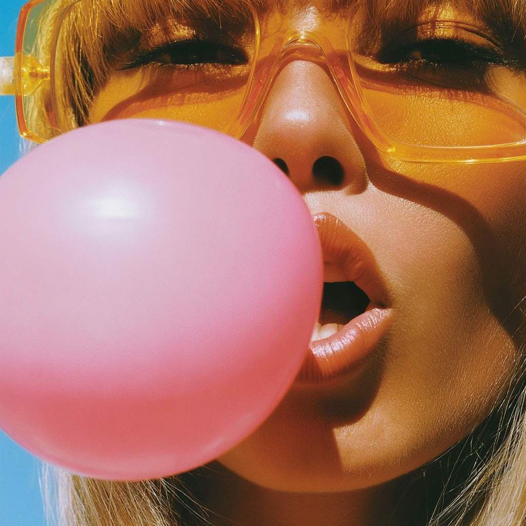
Perfectly smooth skin is one of the clearest signs of an AI portrait. Real skin has pores, fine lines, freckles, variation and small imperfections.
Ask for visible skin texture, natural pores, freckles or fine lines. Use words such as candid, documentary or unretouched when they suit the brand. Avoid stacking beauty terms that push the result toward plastic skin.
Texture should match the distance and lighting. A close portrait will show more detail than a wide lifestyle image. The goal is believable skin, not exaggerated texture.

5. Small details break
An image can look convincing at first glance and fall apart when you inspect the details. Hands, jewelry, glassware, books, phones, typography and repeated patterns are common trouble spots.
Make a quick inspection pass before you approve an image. Zoom into every object that carries meaning. If the subject is holding a product, the product needs to make sense. If there is text in the scene, remove it, replace it in design software or generate the image without it.
Be more specific when an object matters. Describe its material, shape, placement and relationship to the subject. If it does not matter, remove it from the prompt and simplify the scene.

6. Uninvited people appear
You asked for one subject. AI gave you a friend, two strangers and someone half-visible in the background.
State what should not appear. Use a negative prompt when the tool supports one: no other people, empty background, no crowd, no extra hands. It helps to describe the setting as intentionally empty rather than assuming the generator will leave it that way.
Check reflections, mirrors and windows too. An extra person may appear there even when the main background looks clear.
Decide the visual world before you generate
The most useful fix happens before any image appears. Decide the subject, setting, color palette, lighting, lens, texture, mood and exclusions first.
This gives the generator a coherent world to build instead of a loose list of attractive words. It also makes a set of images feel like one brand rather than unrelated experiments.
Then inspect the result like a designer. Check the gaze, anatomy, lighting, skin, small objects and background. Regenerate when the core image is wrong. Crop or retouch when one small detail is the only problem.
AI can create the starting point. Your direction is what makes the final image usable.
Want a more consistent starting point? Explore the AI image prompts and resources from Superhero Design.

Melissa Lunt is the founder of Superhero Design, a template shop specializing in high-converting Showit website templates for coaches, photographers, and creative entrepreneurs. With over 10 years of experience designing brands and websites, she helps business owners launch beautiful, strategic sites without the designer price tag or tech stress. Melissa is passionate about creating handcrafted templates that don’t just look custom—they actually book clients. When she’s not designing, you’ll find her drinking coffee, spending time with family and exploring the outdoors.
Explore Showit templates and launch resources at superherodesign.co.
Comments +