


Color trends in 2026 are moving away from ultra-bright experimentation and toward intentional, grounded palettes that feel elevated, emotional, and timeless. (Pantone’s 2026 Color of the Year ‘Cloud Dancer’ is the proof – It’s the first time EVER that their color of the year has been a shade of white.) For web designers and Showit template designers, this shift is especially important: clients want websites that feel modern without looking trendy so that their websites feel timeless, but still have bold, vivid visuals that stop their visitors scroll.
I’ve handcrafted 6 beautifully on-trend yet completely unique palettes below that reflect what’s shaping on-trend branding for 2026 — from soft neutrals with earthy undertones to rich, unconventional shades that are unapologetically bold and bright, these palettes are your 2026 cheat codes for trendsetting web design, unique brand identities, and conversion-focused layouts.
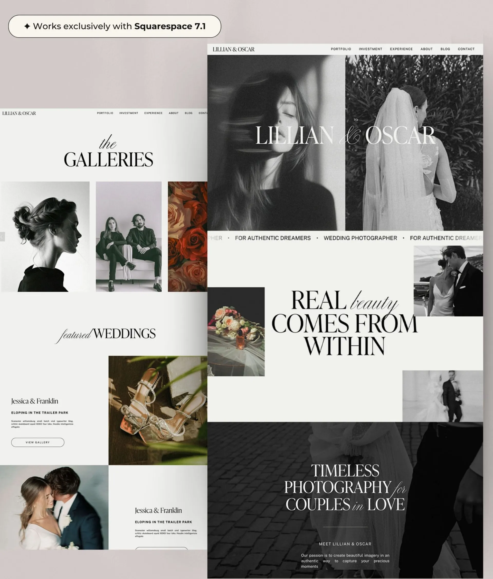
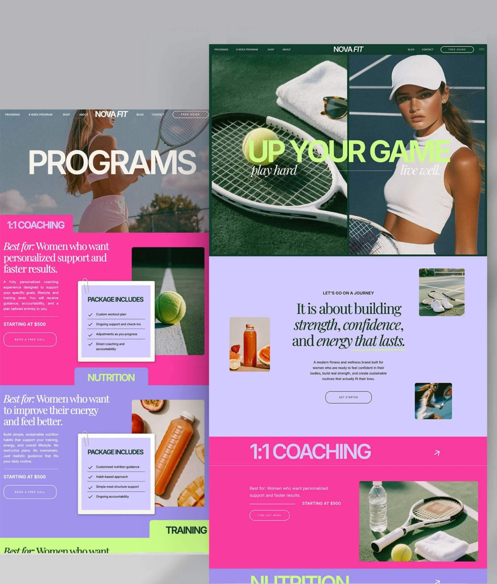
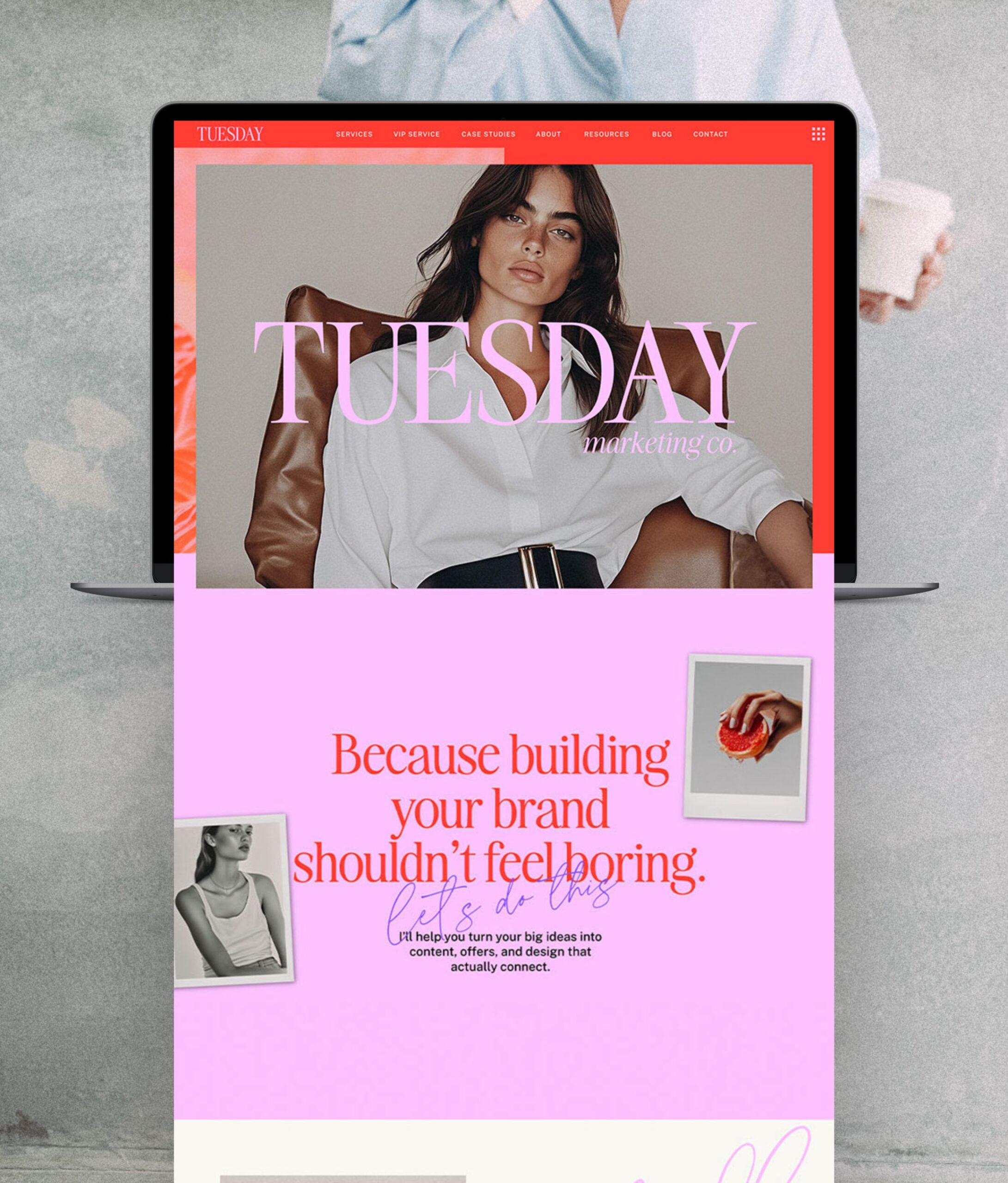
Want to test these color palettes out on a FREE Showit Website Template? Click here to download Luxy Love (yes – 100% for free!) and start designing your dream home for your business without having to invest a cent on your first template, risk-free.

1. Neutral Iced Matcha
Organic, earthy minimalism with a trending matcha green twist.
Palette highlights:
Creamy off-whites, sage greens, muted olive, charcoal gray, and true black.
Why this palette is trending in 2026
Matcha, pistachio…. 2026 is all about green! These organic green undertones are inspired by wellness culture, nature, and slow living. This palette is calming, fresh, and contemporary—perfectly aligned with current branding trends in wellness, creative services, and lifestyle businesses. With this palette, you’re setting the trends, NOT following them.
Why it works for web design & Showit templates
- The light neutrals (#F0EFED, #F9F8F3) create clean, airy layouts ideal for long-scroll Showit sites
- Muted greens (#A5A78F, #F9F8F3) add personality without overwhelming content
- Dark neutrals (#4C4643, #000000) provide strong contrast for navigation, CTAs, and typography
This palette is ideal for:
- Wellness brands
- Coaches and educators
- Minimalist creatives
- Showit templates focused on clarity, calm, and conversion
Design tip: Use the sage and olive tones sparingly as accent colors to keep the site feeling editorial rather than earthy-heavy. If you’re having trouble designing a website that infuses color without being kitchy, I build bold websites that balance personality with modern professional elegance for a website that makes people stop scrolling and start exploring – have a browse through my collection of Showit and Squarespace templates here.

2. Cherry & Plum
Bold, delicious and luxuriously modern
Palette highlights:
Warm white, deep cherry red, plum purple, near-black, and rich brown undertones.
Why this palette is trending in 2026
Moody color palettes are making a strong return — but with more refinement. In 2026, we’re seeing deep reds, plums, and wine tones used as sophisticated statement colors rather than overpowering backdrops. They’re effortlessly sexy and sleek, which is the modern definition of confidence.
Strong, deep colors are the key to conveying bold and confident personality, without using kitschy rainbow colors that can feel juvenile and chaotic.
Why it works for web design & Showit templates
- Deep hues (#651714, #3C0227) create instant brand memorability and will instantly come the backbone for your branding. Use these tones in your branding photos against white backdrops for scroll-stopping wow-factor.
- Dark neutrals (#2A0D08, #000000) feel editorial and luxurious
- Soft white (#F0EFED) balances the richness and maintains readability
This palette is perfect for:
- Luxury service providers
- Creative studios
- Fashion, beauty, and editorial brands
- High-end Showit templates that want to stand out visually
Design tip: Use cherry or plum tones for hover states, buttons, or section dividers to create drama without sacrificing usability.

3. Mediterranean Minimal
Warm, timeless, and effortlessly elevated; inspired by travel trends, Old money and Euro summer aesthetics.
Palette highlights:
Soft white, dusty blue, warm tan, sandy beige, charcoal gray.
Why this palette is trending in 2026
Mediterranean-inspired color palettes continue to grow in popularity as brands lean into capturing the dreams of their clients – calmness, peacefulness and freedom to travel. These colors feel sun-washed, architectural, and effortlessly vintage.
This palette aligns with the rise of “quiet luxury” branding—understated, high-quality, and intentional.
Why it works for web design & Showit templates
- Warm neutrals (#D6CFB5, #C19066) add warmth and an approachable personality to websites
- Dusty blue (#7091A8) introduces calm contrast and visual interest
- Dark gray (#2E2E2E) offers a softer alternative to pure black for text
This palette works beautifully for:
- Wedding and elopement photographers
- Interior designers and architects
- Travel, hospitality, and lifestyle brands
- Showit templates focused on storytelling and imagery
Design tip: Pair this palette with serif typography and generous white space to lean fully into the Mediterranean editorial feel.

4. Editorial Minimalism
Confident, sculptural, and luxuriously modern
Palette highlights:
Soft warm white, stone grey, muted beige and deep espresso brown
Why this palette is trending in 2026
Pantone’s Color of the Year ‘Cloud Dancer’ shows that in 2026 minimalism and chic isn’t white, it’s off white. Editorial minimalism is pure and cold, more soft and architectural. Warm neutrals are replacing flat whites, while deep browns and charcoals add dreamy, inspirational sophistication inspired by the interior design of their dream offices and homes (give me a leather couch in any of these shades right now!)
Why it works for web design & Showit templates
- Warm whites (#F0EFED) keep layouts soft and readable without the harshness of pure white, and allow you to have more freedom with unique, playful typography (vivid colors AND playful type can be overwhelming)
- Muted neutrals (#B9B1A6, #D5C5AC) create seamless section transitions and background layering perfect for accentuating canvases in your templates.
This palette is incredibly flexible for Showit because it allows imagery, fonts, and negative space to shine — perfect for designers who want timeless templates that won’t date quickly.
This palette is perfect for:
- Editorial-style Showit templates
- Luxury consultants & strategists
- Interior designers & architects
- High-end personal brands
Design tip: Use true black sparingly — for headlines, footers, or navigation — and let warm greys and browns do most of the grounding work for a softer, more premium feel.

5. Playful Floral & Citrus
Joyful, expressive, and playful with a retro soul
Palette highlights:
Floral pink and marigold yellow brought down to earth with luxurious neutrals
Why this palette is trending in 2026
After years of muted neutrals dominating the web, designers are craving optimism. In 2026, we’re seeing color return — but in a refined, intentional way. The Marie Antoinette inspired Floral pinks, citrus yellows, and golden tones in this palette are grounded with neutrals and dark anchors, making them feel sophisticated rather than kitsch. It’s all about control!
Why it works for web design & Showit templates
- Intentional white (#F0EFED) keeps bold colors from overwhelming the layout
- Pink (#CC6482) and yellow (#FABB02) draw attention beautifully for CTAs and highlights, adding pops of color and confidence
This palette is perfect for:
- Retro inspired Lifestyle brands
- Florists, wellness, and food-related businesses with personality-driven branding
- Coaches and educators with a warm brand voice
Design tip: Use citrus yellow sparingly for buttons or accent graphics, or subtly in link hovers

6. Warm Beige Café Latte
Comforting, grounded, and effortless
Palette highlights:
Latte beige, caramels and a dark roast coffee brown
Why this palette is trending in 2026
2026 is the year of being cosy and intentional, and there’s no better way to reference that than with EVERY entrepreneur’s favorite hour of their day – Sitting down with a coffee! This café-inspired palette feels like a warm hug with a layered, tonal, and deeply intentional edge. With rich tones lifted from coffee beans, handmade ceramics, and cozy interiors, these colors are gorgeous tools for communicating calm.
Why it works for web design & Showit templates
- Warm whites (#F0EFED) and oat tones (#D7B796) create breathable layouts, that work perfectly as sitewide background colors.
Deep browns (#432305, #1C0C00) can be used for text OR as canvas backgrounds with white text for contrast. - For Showit designers, this palette is gold: it pairs beautifully with photography, feels timeless across industries, and works exceptionally well for long-form, content-heavy sites.
This palette is perfect for:
- Coaches, consultants, and educators – brands with a lot to say
- Wellness, skincare, and slow-living brands
- Service providers who want to feel calm and credible
Design tip: Alternate canvases with dark and light backgrounds to create separation without needing borders or heavy dividers — this keeps the design soft, modern, and cohesive.
How to Use these Colors inside your Showit Website Template
- Open your Showit site and click the Site tab → Design Settings.
- In Design Settings open the Site Style / Color Palette — you’ll see the global color swatches.
- Click the swatch you want to change, paste your hex code from the image above (include the
#) into the hex field in the color picker, then press Enter. - Hit Save/Done — Showit will apply that master color site-wide to anything using that swatch. Preview on the canvas and publish when you’re happy.
- Enjoy your new bold branding!
(Pro tip: Pin your favorite color-combo images above to your design inspiration Pinterest board so you can quickly pull hex codes for future projects!)

Feeling ready to elevate your branding and finally build the bold, confident website that takes your business to the next level? Shop my full range of best-selling website templates here (they’re viral on Pinterest for a reason!) and Follow me on Instagram for more design resources that you can use to skyrocket your business right now for free!

Melissa Lunt is the founder of Superhero Design, a template shop specializing in high-converting Showit website templates for coaches, photographers, and creative entrepreneurs. With over 10 years of experience designing brands and websites, she helps business owners launch beautiful, strategic sites without the designer price tag or tech stress. Melissa is passionate about creating handcrafted templates that don’t just look custom—they actually book clients. When she’s not designing, you’ll find her drinking coffee, spending time with family and exploring the outdoors.
Explore Showit templates and launch resources at superherodesign.co.


Comments +