


In 2026, female-led brands are embracing personality again with unexpected color pairings, bold contrast, playful energy and websites that feel like an experience instead of another cookie-cutter template.
The brands attracting the most attention aren’t necessarily the loudest—they’re the ones that feel memorable. The moment someone lands on your homepage, they should instantly get a sense of you.
If you’re a female entrepreneur building a personal brand or service business, your colors should make people want to keep scrolling and make you feel excited about the website you’ve created.
Here are six bold, bright, unique color combinations you can effortlessly add to your branding palette right now that will bring your brand to life this year whilst skyrocketing your engagement with dream clients.

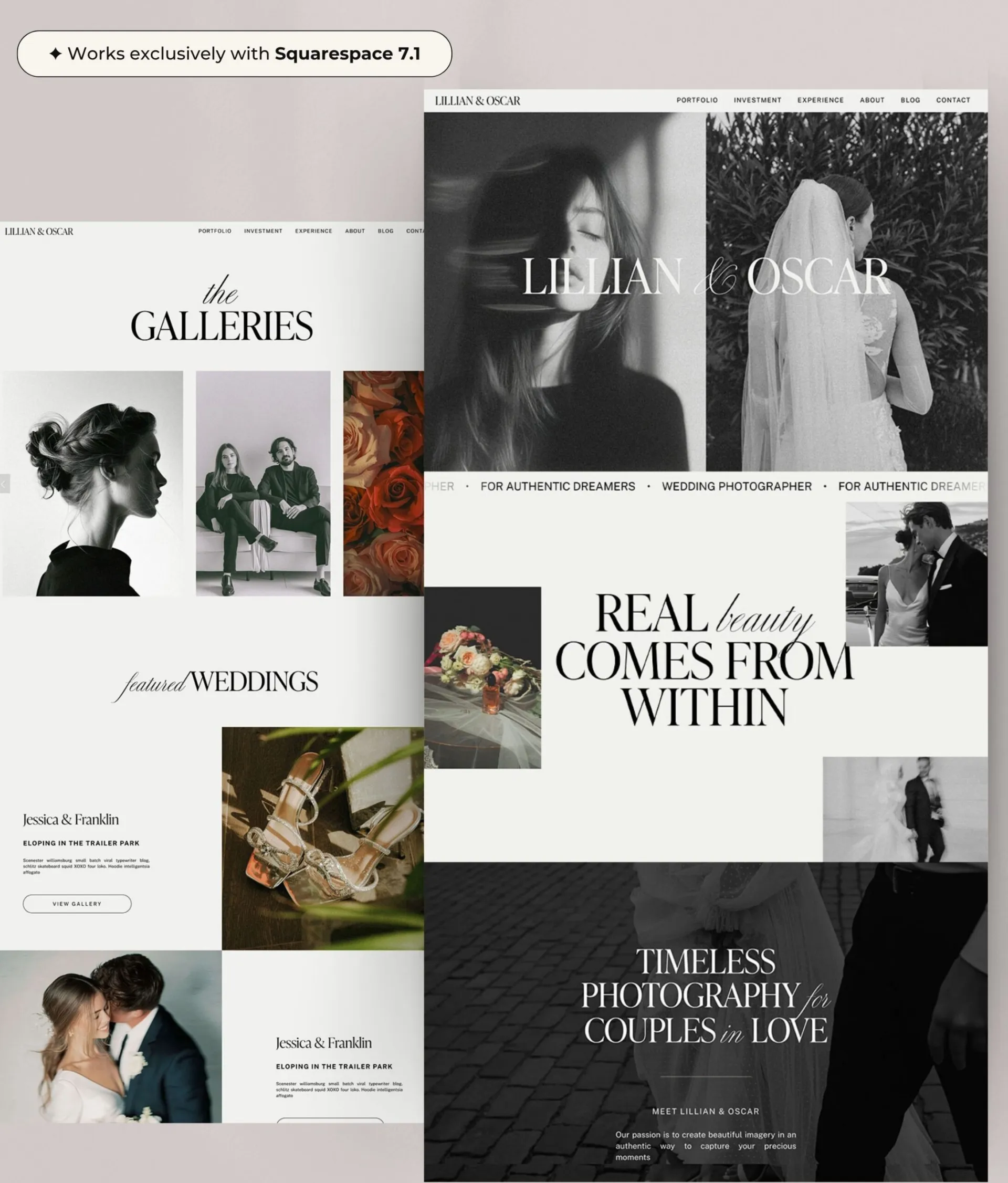
Cream & Purple
The elevated cool-girl pairing
If quiet luxury had a colourful older sister, this would be her.
Cream keeps everything feeling clean and effortless, while purple injects just enough personality to stop your website looking safe or predictable. It feels feminine without leaning into cliché pinks, making it a favourite for brands wanting to look premium with a creative edge.
Perfect for
- Brand designers
- Creative consultants
- Interior designers
- Business coaches
- Copywriters
- Wedding professionals
The vibe
- Boutique hotel aesthetic
- Fashion editorial
- “Booked out” energy
- Calm confidence
- Creative authority

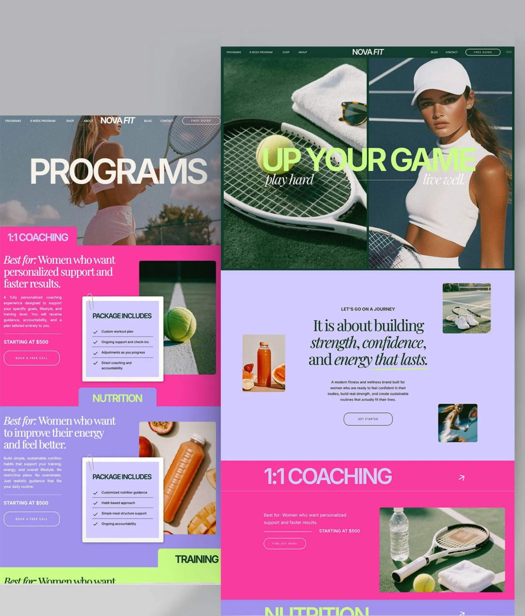
Hot Pink & Pastel Pink
The personality-first pairing
This colour combination doesn’t whisper – feminine doesn’t have to mean quiet!
It says your business is fun, approachable and full of confidence. The brighter pink catches attention while the softer pink keeps everything feeling polished instead of overwhelming.
For personal brands especially, this palette instantly makes your website feel more human.
Perfect for
- Hair stylists
- Beauty brands
- Content creators
- Social media managers
- Fashion boutiques
- Female fitness coaches
The vibe
- Main character energy
- Girls’ trip in Ibiza
- Espresso martinis after work
- Confident without taking itself too seriously
(Designer tip: This color combination is SO magnetic for a professional female target audience, so would skyrocket engagement across social media! Peek my Canva Post Bundles so that you can effortlessly take this palette and drop it into beautiful templates for on-brand, highly converting posts ready to go in minutes!)

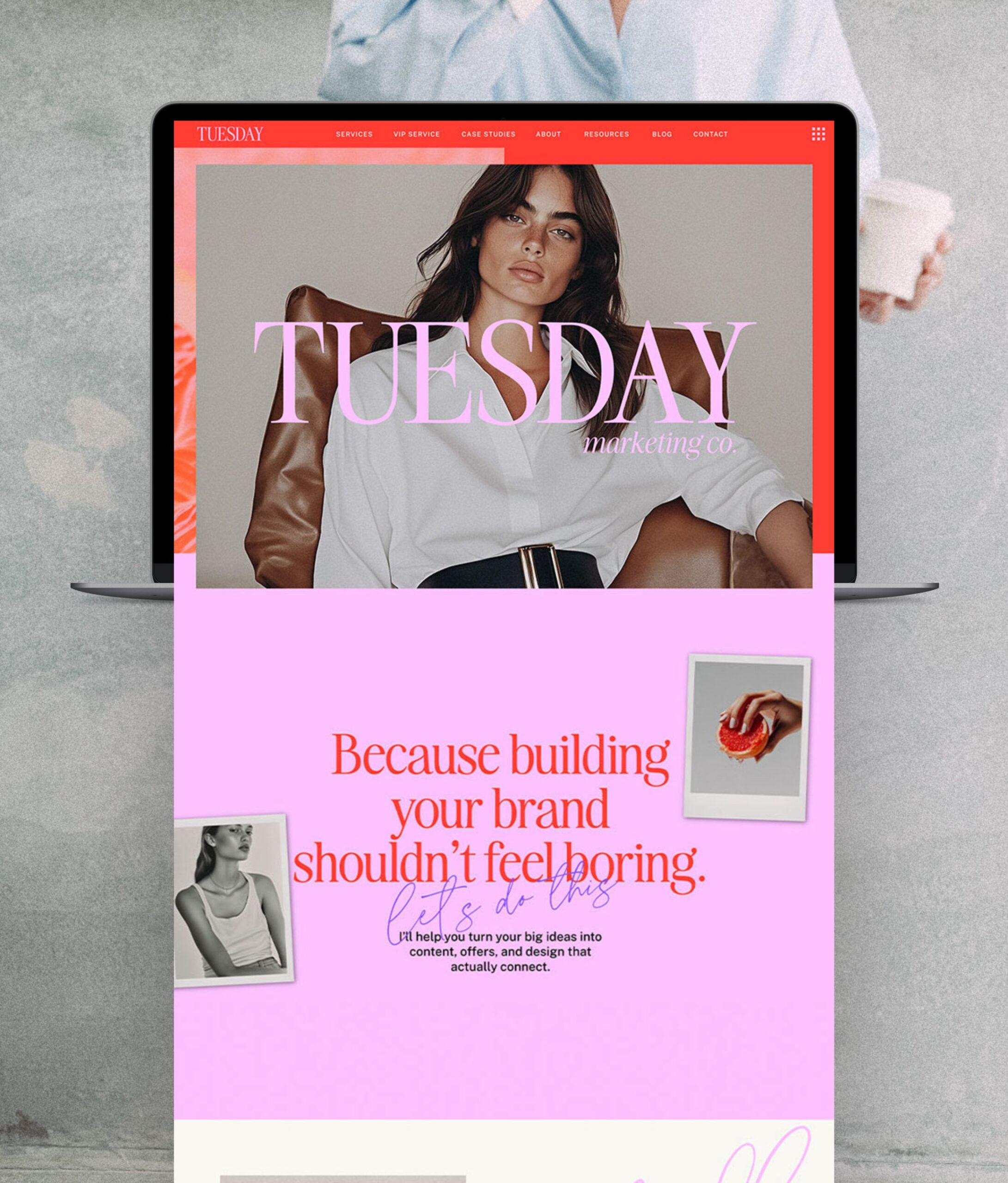
Cherry & Pink
The magnetic luxury pairing
Cherry has quietly become one of the biggest trend colours for branding.
Paired with soft pink, it creates a website that feels expensive, feminine and emotionally engaging without relying on predictable black-and-white luxury branding. Cherry naturally creates warmth and excitement, while pink softens it enough to keep your brand approachable. Visitors stay longer because the colour palette feels immersive rather than flat.
It’s rich, bold, sexy and memorable.
Perfect for
- Photographers
- Florists
- Jewellery brands
- Wedding businesses
- Event planners
- Luxury service providers
The vibe
- Red lipstick
- Romantic city breaks
- Designer perfume
- Candlelit dinner reservations

Purple & Yellow
The creative rebel pairing
Not every business wants to blend in.
Purple and yellow are for entrepreneurs building brands with huge personalities. They’re unexpected, playful and impossible to scroll past. High-contrast palettes naturally guide the eye around a page, making portfolios, offers and call-to-action buttons impossible to miss while giving your entire brand a youthful, trend-led feel.
If your clients choose you because you’re different, your website should reflect that.
Perfect for
- Illustrators
- Creative agencies
- Artists
- Graphic designers
- Course creators
- Podcast hosts
The vibe
- Pinterest trend report
- Fashion Week
- Colourful coffee shops
- Creative studios

Vivid Blue & Muted Pink
The modern CEO palette
Blue builds trust. Pink adds personality.
Together they create one of the most balanced colour combinations for female entrepreneurs who want to look established without feeling corporate (and I know it works because these are two colors I based my rebrand on and I’ve NEVER looked back.)
It’s polished—but still feels warm.
Perfect for
- Virtual assistants
- Online educators
- Coaches
- Marketing consultants
- Membership businesses
- Freelancers
The vibe
- Effortless productivity
- Confident leadership

Lilac & Orange
The feel-good pairing
Lilac brings softness while orange injects optimism, creating a website that’s playful, creative and packed with positive energy; Colorful without becoming chaotic. Orange naturally draws attention to important buttons and offers, while lilac keeps the overall experience calm and enjoyable. The result is a website that feels memorable, optimistic and incredibly easy to explore.
Perfect for
- Wellness brands
- Creative coaches
- Nutritionists
- Yoga teachers
- Community businesses
- Lifestyle creators
The vibe
- Summer mornings
- Fresh flowers
- Matcha cafés
- Pinterest mood boards
- Creative weekends away

How to Use these Colors inside your Showit Website Template
- Open your Showit site and click the Site tab → Design Settings.
- In Design Settings open the Site Style / Color Palette — you’ll see the global color swatches.
- Click the swatch you want to change, paste your hex code from the image above (include the
#) into the hex field in the color picker, then press Enter. - Hit Save/Done — Showit will apply that master color site-wide to anything using that swatch. Preview on the canvas and publish when you’re happy.
- Enjoy your new bold branding!
(Want to test these fonts out on a FREE Showit Website Template? Click here to download Luxy Love (yes – 100% for free!) and start designing your dream home for your business without having to invest a cent on your first template, risk-free.)

The Most Successful, High-Converting Websites lead with Professionalism and Personality: Here’s How to Master it.
The biggest web design trend of 2026 isn’t a specific font, layout or animation—it’s personality.
The websites people remember are the ones that feel alive. They have colour, confidence and enough individuality to stop someone mid-scroll and make them think, “This brand is so me.”
Whether you’re drawn to elevated purples, energetic pinks or playful lilacs, choosing the right colour palette is one of the fastest ways to create a website that feels magnetic from the very first click.
Feeling ready to elevate your branding and finally build the bold, confident website that takes your business to the next level? Shop my full range of best-selling website templates here (they’re viral on Pinterest for a reason!) and Follow me on Instagram for more design resources that you can use to skyrocket your business right now for free!

Melissa Lunt is the founder of Superhero Design, a template shop specializing in high-converting Showit website templates for coaches, photographers, and creative entrepreneurs. With over 10 years of experience designing brands and websites, she helps business owners launch beautiful, strategic sites without the designer price tag or tech stress. Melissa is passionate about creating handcrafted templates that don’t just look custom—they actually book clients. When she’s not designing, you’ll find her drinking coffee, spending time with family and exploring the outdoors.
Explore Showit templates and launch resources at superherodesign.co.


Comments +