You bought a Squarespace template, or you picked one of Squarespace’s own, and now you’re staring at someone else’s demo site wondering where to start. Here’s how to customize a Squarespace template without redoing half your work later.
The short answer: do the site-wide decisions first, then the page-by-page content, then the fine-tuning. Most frustration comes from doing it backwards, like perfecting one section’s colors before you’ve set your palette, then watching everything shift when you finally do.
The order to customize a Squarespace template
- Gather your content (copy, photos, logo, brand colors and fonts).
- Set your fonts in Site Styles.
- Set your color palette and check the color themes.
- Replace the demo text, page by page.
- Swap the photos without breaking the layout.
- Adjust individual sections only where they need it.
- Check every page in mobile view.
- Add your logo, favicon and SEO titles.
- Clean up the demo pages you’re not using, then publish.

Everything below is for Squarespace version 7.1, which is what current templates are built on. If your site is on 7.0, a lot of these settings work differently.
Before you start: get your content together
Honestly, this is the easiest step to skip, and skipping it is how one weekend of customizing turns into three.
Have these ready before you open the editor:
- Your copy, at least a rough draft for each page. A template looks finished with demo text in it, which makes it easy to forget the words are the hard part.
- Your photos, with a mix of horizontal and vertical shots. Note which ones you’d put on the homepage.
- Your brand colors as hex codes (like #F4EDE4), not “kind of a warm beige.”
- Your fonts, and whether you’re allowed to use them on a website. Font licenses for print and web aren’t always the same.
- Your logo as a PNG, plus a small square version for the browser tab icon.
If the copy is what’s holding you up, my free ChatGPT prompts for writing your website copy walk you through Home, About, Services and more. Then you edit the draft so it actually sounds like you.
Step 1: set your fonts in Site Styles
Open any page and click the paintbrush icon in the top-right corner. That opens Site Styles, where your site-wide fonts, colors, buttons and spacing live. (Squarespace’s guide to style changes has the full list.)
Under Fonts, you can:
- Choose a font pack if you want Squarespace to pair fonts for you.
- Change the base size. All text on the site scales relative to it, so this one setting changes the feel of the whole site.
- Style Headings, Paragraphs, Buttons and Miscellaneous separately: font, weight, line height, letter spacing and size.
If you’re using a template someone designed, check the fonts before you change them. Many templates use specific fonts on purpose, and the product page usually tells you whether they’re free or need a separate license. You can always swap them for Google Fonts.
Want to use your own brand font? You can upload .otf, .ttf, .woff or .woff2 files right in the font menu, as long as your font license allows web use (Squarespace’s custom font guide).
Quick fix: if your headings feel huge after swapping fonts, don’t shrink every heading one by one. Adjust the heading size in Site Styles once and let it apply everywhere.
Step 2: set your color palette (and understand color themes)
Still in Site Styles, click Colors, then Edit palette. Every Squarespace site uses a five-color palette, and you can paste your hex codes straight into the color picker.
Here’s the part that trips people up. Squarespace builds ten color themes from your palette, and each section on your site uses one of those themes. If you edit a color theme later, the change affects every section on the site using that theme, not just the one you’re looking at (Squarespace on page section styles).
So if you change a button color in one section and suddenly your contact page looks different too, that’s why.
What I’d do:
- Set your five palette colors first.
- Scroll through the homepage and note which sections look dark, light or accented.
- Only then adjust individual color themes. Check a couple of other pages each time.

Step 3: replace the demo text, page by page
Start with the homepage, then go through each page in your navigation in order. Click a text block to edit it.
A few things make this go faster:
- Keep roughly the same length as the demo text where you can. A headline written for four words will look off with fourteen. If your real headline is longer, change the size or the layout rather than squeezing it in.
- Rewrite the headings to say what you do. “Hello, gorgeous” might be cute in the demo, but “Wedding photography for couples who hate posing” tells a visitor she’s in the right place.
- Replace every testimonial and statistic. Demo testimonials are placeholders. Only use real quotes from real clients, or delete the section until you have them.
If you’re not sure what each section of your homepage should say, my post on what to put on a homepage goes through the six questions a new visitor needs answered.
Step 4: swap photos without breaking the layout
Don’t delete an image block and add a new one. You’ll lose the size and placement the designer set. Instead, click the image block, click the pencil icon, and choose Replace (Squarespace on image blocks).
Then:
- Match the orientation. If the demo uses a vertical photo, use a vertical photo. A horizontal shot in a vertical crop usually cuts off something important.
- Set the focal point. Squarespace lets you choose which part of the photo stays in view when the image is cropped, so the person in the photo doesn’t lose the top of her head (how focal points work).
- Add alt text while you’re there. It’s in the same image editor. Describe what’s actually in the photo, in plain words.

Step 5: adjust sections only where they need it
Once your styles and content are in, look at each section and decide if it needs its own tweaks. Click Edit on the page, hover over the section, and click Edit Section. You’ll see tabs for:
- Design: spacing, height and layout options (the name changes for some section types).
- Background: add an image, video or art behind the section.
- Colors: pick which color theme this section uses.
Use this for contrast and rhythm, like a dark section to break up three light ones in a row. If you find yourself editing every section individually, the fix probably belongs back in Site Styles.
This is also the time to delete sections that don’t fit your business. A template is a starting point, not a checklist. If you don’t have a podcast, the podcast section goes. If a page looks empty after you remove things, fix the spacing (bring related text, photos and buttons closer together) before you add filler content.
Step 6: check every page in mobile view
Squarespace resizes your site for phones automatically, but “automatically” isn’t the same as “looks right.”
While editing a page, click the Mobile View icon in the top-right corner. In Squarespace’s drag-and-drop sections (called Fluid Engine), you can move, resize and even hide blocks on mobile without changing the desktop layout (designing mobile layouts).
Two things to know:
- Layout changes are separate, content changes aren’t. Moving a block on mobile won’t move it on desktop. But editing the text or a button link changes it on both.
- Device view is a preview, not a guarantee. Open the live site on your actual phone too.
Look for headlines that break awkwardly, photos that crop out the person, and buttons that end up far away from the text they belong to.

Step 7: add your logo, favicon and SEO titles
These are small, but they’re the details that make a site look like yours instead of a demo.
- Logo: add it in your site header. Your logo replaces the site title, and on 7.1 you can upload a separate logo for mobile (site title and logo display).
- Favicon (browser icon): Squarespace recommends a PNG between 100 x 100 and 300 x 300 pixels, under 100 KB. If you skip this, your tab shows the default Squarespace cube (favicon guide).
- SEO titles and descriptions: in the Pages panel, open a page’s settings and go to the SEO tab. Give each page its own title, like “Wedding Photography Pricing | Your Studio Name,” and a short description of what’s on it. Squarespace notes that search engines cut descriptions off around 160 characters (SEO descriptions).
Filling these in doesn’t guarantee rankings, but leaving the demo titles in place definitely doesn’t help.
Step 8: clean up demo pages before you publish
Templates often include pages you won’t use, and it’s easy to just drag them into the Not linked section of the Pages panel and forget them.
The catch: Squarespace says pages in Not linked don’t show in your navigation, but they’re still indexed by search engines and reachable by anyone with the URL (moving pages around your navigation). So a half-edited demo page with someone else’s photos could still turn up in Google.
For anything you’re not using, either delete it or turn off Enable Page in its page settings. A disabled page stays in your Pages panel, but visitors and search engines can’t reach it (enabling and disabling pages), so it’s the right place for pages you might finish later.

What a Squarespace template won’t do for you
Squarespace is great for getting a polished site up fast, and its structured system keeps things looking consistent. But I’d be lying if I said it’s perfect. A few honest trade-offs:
- It’s not pixel-perfect. Sections don’t always stay exactly where you put them, and if you care about precise placement, it can feel limiting.
- Site Styles works site-wide. You can’t style just one heading differently from every other heading in the settings. That kind of one-off change needs custom CSS code.
- Switching templates on an existing site isn’t automatic. If you already have a Squarespace site, a new template usually means a new site, and you’ll copy your content over by hand.
If you want full control over every detail, Showit might suit you better. I compare the two in Squarespace vs Showit: which platform should you choose?
Skip the blank layout and start with a designed template
If you’re customizing Squarespace’s free layouts and it still feels like you’re designing from scratch, a designed template gives you the layout, spacing and page structure already done, so most of your time goes into your own words and photos.
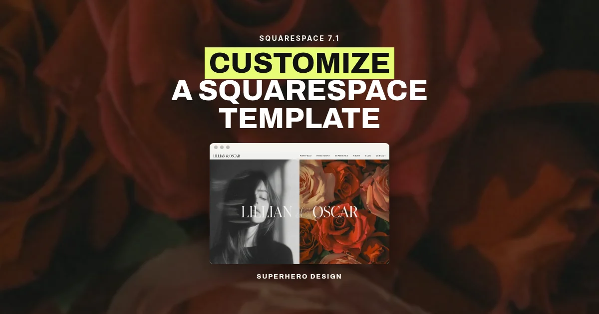
My Squarespace website templates are built for Squarespace 7.1 for photographers, coaches and creative businesses, and they’re $297 each. If you want to see what that looks like before you buy, open the Lillian & Oscar Squarespace template page and click “View live demo.” The demo uses placeholder photos and text, so it shows the starting point, not a finished customer website.

After you buy, you’ll get a Squarespace contributor invitation by email. Accepting it gives you access to a new Squarespace 7.1 site with the template already in it (how to accept a contributor invitation), and from there you work through the steps above. You’ll still need your own Squarespace plan to publish. Each template is licensed for your own website, or for one client project if you’re a designer.
Not ready to buy yet? Start with the free website copy prompts so your words are ready when your template is.

Melissa Lunt is the founder of Superhero Design, a template shop specializing in high-converting Showit website templates for coaches, photographers, and creative entrepreneurs. With over 10 years of experience designing brands and websites, she helps business owners launch beautiful, strategic sites without the designer price tag or tech stress. Melissa is passionate about creating handcrafted templates that don’t just look custom—they actually book clients. When she’s not designing, you’ll find her drinking coffee, spending time with family and exploring the outdoors.
Explore Showit templates and launch resources at superherodesign.co.
Comments +