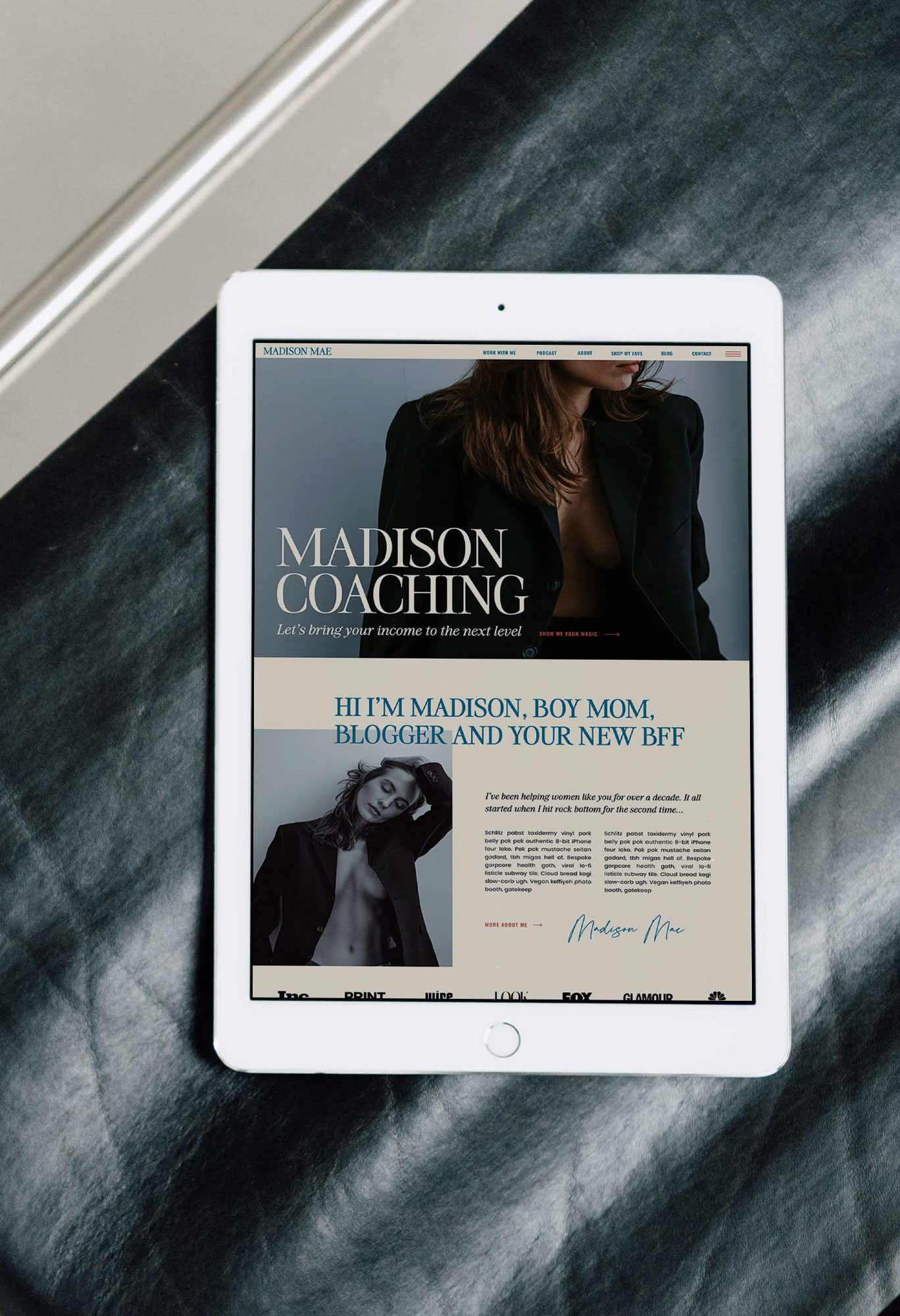
A homepage can look beautiful and still leave someone wondering what the business actually does. I have seen gorgeous hero images, perfectly styled type and a button that says “Discover more.” Then I have to scroll three times to find the offer.
If you’re wondering what to put on a homepage, start with the questions a new visitor is trying to answer. Your sections are simply places to put those answers. This approach works whether you’re starting from a blank page or customizing a website template.
1. Am I in the right place?
The first screen should help someone recognize the offer, the audience or the problem. Open your site without scrolling and give yourself ten seconds. Can you tell what is sold, who it’s for and where to go next? If you can’t, the hero needs another pass.
A useful hero often contains a clear headline, one supporting sentence and a button. For example, a photographer’s homepage might lead with “Wedding photography for Chicago couples who want the day to feel like themselves,” followed by a sentence about the approach and a button to view galleries or inquire. A clever phrase can stay, but it shouldn’t be the only clue.
Use the image to reinforce the message rather than replace it. A beautiful portrait does not explain which service is available or where the business works.
2. Do you understand what I need?
Name a situation the visitor recognizes before describing your method. A photographer considering a pricing guide may be tired of answering the same package questions in every inquiry. A designer’s client may talk easily about her business but freeze when handed a blank document labeled “website copy.” Both are more useful starting points than “We help businesses thrive.”
Keep this section brief and specific. Two or three recognizable details can do the job. Avoid a long list of generic frustrations that could describe anyone with a business.
3. Can you actually help?
Explain the offer plainly, then show proof that supports it. Depending on what you sell, this might be a finished project, a sample of the deliverable, a real customer review, a relevant credential or a peek at your process.
Put the proof close to the claim. If you say your templates are easy to customize, show examples of different businesses using the same starting structure. If you promise a smoother handoff, explain what is included in that handoff. A testimonial five sections later may never be seen by the person who needed it.
For a service business, this is often a good place for a short services overview with a clear link to each offer. For a shop, show the product categories or a small selection of best fits. Don’t make people guess what the button leads to.
4. Why choose this option?
Explain what changes the experience. It could be a particular process, the kinds of projects you specialize in, the format of the deliverable or the way you make decisions with clients. “A seamless, tailored approach” could sit on almost any homepage. “You’ll see a homepage outline before I start designing” is something a prospective client can picture.
You don’t have to claim you’re the only person doing something. Give the visitor enough information to see whether your way of working fits her needs. A short founder note can help here when your perspective is genuinely part of the offer, but keep the full story for the About page.
5. What happens next?
People hesitate when the path is unclear. If someone clicks to book, will she choose a time immediately or fill out an inquiry form first? If she buys a digital template, what arrives afterward and what will she need to customize? Explain the next one or two steps in plain language.
You don’t need a separate Process page for every business. A compact “How it works” section can answer the biggest questions right beside the offer. If price is important to qualification, give a starting price or explain how to get a quote when that’s appropriate for the business.
6. What should I do now?
Choose one primary path for the homepage. You can repeat the same action later, once visitors have more information, without making every section point somewhere different. For a service provider, that might be “Inquire about your project.” For a product, it might be “Shop the templates.” Secondary links can still exist, but the main choice should be easy to spot.
Make the button label match the destination and keep the next page consistent with the promise. If the call to action says “See pricing,” it should lead to pricing rather than a generic contact page.
A simple homepage section order to start with
- Hero: what you offer, who it’s for and the primary next step.
- Recognition: the situation or question that brought the visitor here.
- Offer: the services or products that solve it, with a route to learn more.
- Proof: relevant work, a customer quote or a concrete process detail.
- Difference and process: why this approach fits and what happens next.
- Final call to action: repeat the clear primary path.
This is a starting structure, not a rule. Some sites need proof earlier. A one offer business may need more detail about that offer; a shop with multiple product types may need a clearer way to choose. Use the six questions to decide what belongs and where.
Check the homepage before you design the next section
Read it as someone who has never heard of the business. Circle any phrase that requires inside knowledge, any promise without evidence and any button with a vague destination. Then check the page on a phone. Is the offer visible early? Can someone skim the headings and still understand the path?
Often the highest value fix is a clearer headline, a visible offer, proof next to the claim or a more specific button. If you’re building in Showit, my website design checklist can help with the final review. If you need a starting layout, you can browse the Showit website templates.

Melissa Lunt is the founder of Superhero Design, a template shop specializing in high-converting Showit website templates for coaches, photographers, and creative entrepreneurs. With over 10 years of experience designing brands and websites, she helps business owners launch beautiful, strategic sites without the designer price tag or tech stress. Melissa is passionate about creating handcrafted templates that don’t just look custom—they actually book clients. When she’s not designing, you’ll find her drinking coffee, spending time with family and exploring the outdoors.
Explore Showit templates and launch resources at superherodesign.co.
Comments +