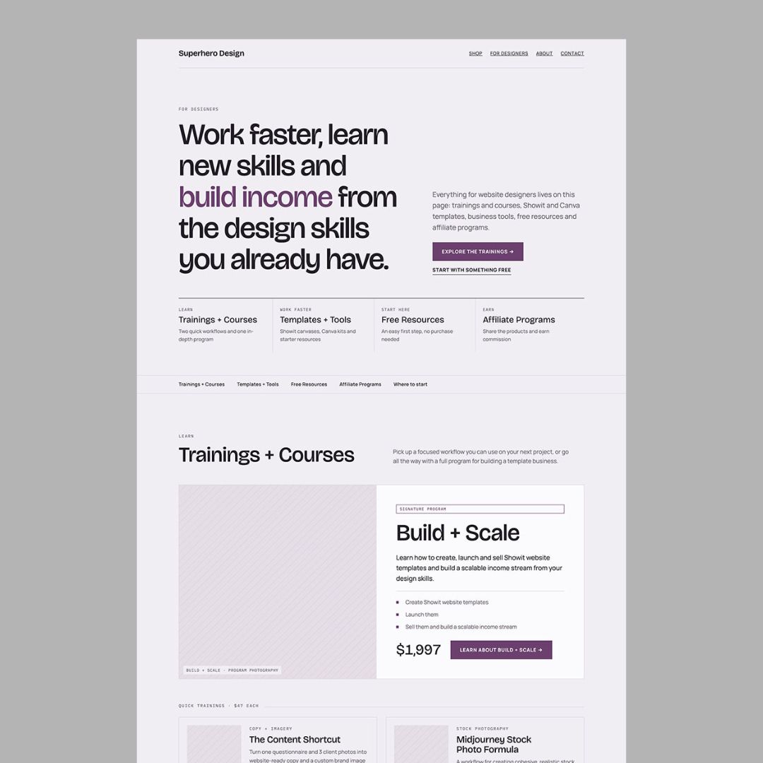
After I posted that I don’t start website pages in Showit anymore, a designer messaged me asking for the prompt and my whole workflow. She said she finds it really hard to use AI for her design work.
I get it. If you type “design a website for my client” into Claude, you are leaving almost every decision up to Claude. You will probably get a page that looks finished before anyone has decided if the content is even in the right order.
The short version: one page at a time, Claude gets the copy (if you have it), the offer, your testimonials and the main action you want visitors to take. You get back a visual mockup to review and fix before you rebuild it in Showit.
I’m not looking for the final design here. I want the wireframe to show me the hierarchy of information and give me a general idea of the layout. I can make it pretty later inside Showit, where I’d be doing that anyway.
What are you actually asking Claude to do?
A wireframe is a rough layout that shows the structure of a page. Headings, text blocks, image boxes, testimonials and buttons. Placeholder photos are fine and the fonts do not matter yet.
Claude takes the information you give it and turns it into something you can look at and rearrange, and then you decide if what Claude suggested actually makes sense for the business.
So basically, Claude can show you how the content stacks on a phone, but Claude has no idea if the offer details are right or if a testimonial actually backs up the claim sitting next to it. A good looking mockup also tells you nothing about whether the page will convert. That part is still on you.
What do you need to give Claude before you paste the prompt?
Start with one page. A homepage and a sales page need completely different decisions, and if you ask for the whole website at once it gets a lot harder to tell which page has the weak structure.
Here’s what to have ready:
- The page goal. Be specific. Get inquiries for a brand photography session, sell one template or get people registered for a training.
- The audience. Who are they, what do they need to know and what might stop them from clicking?
- The offer details. What’s included and what happens after someone clicks? Only include pricing if it’s confirmed and actually belongs on this page.
- The copy. Paste approved copy in labeled sections, or give Claude a messaging outline and tell it clearly that the copy is still a draft.
- The proof you actually have. Real testimonials, portfolio examples, credentials or verified results. Tell Claude what each one supports.
- The main button. The button wording and where it goes. “Inquire about a brand session” gives Claude way more to work with than “add some buttons.”
If the client content is still scattered across a questionnaire and a pile of emails, get it organized first. My AI website workflow for web designers walks through that step.
Where do you put the prompt in Claude?
Open Claude on your computer (the web version) and start a new conversation just for this page. Fill in the page details in the prompt below and paste it in. You can also attach a copy document, just tell Claude which file has the approved copy.
You want Claude to build a visual artifact so you are looking at the actual page instead of reading a list of suggested sections. Claude’s Artifacts guide covers how to create and revise them. If artifacts aren’t showing up for you, check your capability settings in Claude.
The prompt also asks for a self-contained HTML file. That just means all the layout and styling lives in one file. If Claude gives you an HTML file to download, open it in your browser to see the page. You do not need to touch the code.
The prompt (copy and paste this)
Here’s the full prompt. You only need to fill in the page details and sections. It spells out the content rules, the visual output, how mobile should behave and that this page is getting rebuilt in Showit, so Claude isn’t left guessing what “make me a wireframe” means.
I’m a website designer and I want you to help me plan and visually mock up a new page for a website.

I do NOT just want a written wireframe or a description of where things should go.

I want you to actually create the page as a responsive HTML/CSS mockup that I can preview visually in Claude. I will use this as a high-fidelity wireframe and layout reference before rebuilding the final page in Showit.

Here is the page:

PAGE NAME:
[Page name]

PRIMARY GOAL:
[What this page needs to accomplish]

TARGET AUDIENCE:
[Who the page is for]

WHAT I WANT SOMEONE TO UNDERSTAND IMMEDIATELY:
[The main idea the visitor should get near the top]

The page needs to include these categories or sections:

[SECTION / CATEGORY 1]
[List the actual content, products or information that belongs here. Include names, prices and descriptions where relevant.]

[SECTION / CATEGORY 2]
[List the actual content.]

[SECTION / CATEGORY 3]
[List the actual content.]

Before you design the page, think like both a conversion-focused web designer and a UX designer.

Determine the best hierarchy for the content instead of simply displaying everything with equal importance.

Then create the complete responsive HTML/CSS page mockup.

Include:
- a clear hero section
- strong page headline and supporting copy
- jump navigation if it would make a long page easier to navigate
- clear visual separation between categories
- strategic content or product hierarchy
- cards or featured sections where appropriate
- real names, descriptions, prices and CTAs from my prompt
- a strong closing CTA
- desktop and mobile responsive behavior
- enough realistic copy that I can judge the actual layout

Keep the design sophisticated and editorial rather than looking like a generic SaaS website.

Do not spend time creating elaborate finished graphics. Use tasteful image placeholders where final photography or product graphics would eventually go.

Do not invent products, prices, testimonials, results or business facts I have not supplied.

The goal is to help me make decisions about hierarchy, spacing, section order, content density and conversion before I build the real page.

Build the mockup now so I can preview it visually.
The part that matters most is the page details. If you leave “[Who the page is for]” in there, you’ve handed Claude a blank right where a real design decision should be. And if you don’t have approved copy yet, use a messaging outline and read every word Claude writes before anyone treats it as final.
What does a filled-in prompt look like?
Here’s a filled-in version for a “For Designers” page using my own products, so you can see how much detail I’m actually giving Claude. Paste your version over the page details and sections in the prompt above.
PAGE NAME:
For Designers

PRIMARY GOAL:
Create one central page where website designers can discover my paid trainings, courses, templates, business tools and free resources.

TARGET AUDIENCE:
Freelance website designers and designers who want to make more money from their existing design skills.

WHAT I WANT SOMEONE TO UNDERSTAND IMMEDIATELY:
This is where designers can find practical resources to help them work faster, learn new skills and create additional income streams.

TRAININGS + COURSES:
- The Content Shortcut — $47. Turn one questionnaire and 3 client photos into website-ready copy and a custom brand image library with AI.
- Midjourney Stock Photo Formula — $47. A workflow for creating cohesive, realistic stock photo collections with Midjourney + ChatGPT.
- Build + Scale — $1,997. Learn how to create, launch and sell Showit website templates and build a scalable income stream from design skills.

TEMPLATES + TOOLS:
- Canvas Pro Collection — 285+ pre-designed Showit canvases for designers.
- Canva Niche Kits — ready-to-customize Canva templates for client work.
- Include smaller starter resources as secondary products rather than giving every item equal visual weight.

FREE RESOURCES:
Create a clearly separate area for free resources designers can use as an entry point.

AFFILIATE PROGRAMS:
Include the designer affiliate program and template shop affiliate program.

PAGE STRATEGY:
This page contains a lot of offers, so prioritize easy scanning and hierarchy. Use jump navigation if helpful. Quick trainings should not have the same visual weight as the in-depth program. Group related resources together. Create a strong closing CTA.

VISUAL DIRECTION:
Sophisticated, editorial and creative. The final page will be rebuilt in Showit. Use tasteful placeholders instead of spending time creating final product graphics.
Notice what’s missing from that prompt. I’m not asking Claude to write a five star review, pick a price or make up how many designers have taken a course. If something isn’t in the prompt, it shouldn’t show up on the page, and that makes the mockup a lot easier to review honestly.

What should Claude give you back?
You should get three things: a section order, a visual page you can actually look at and a guide for rebuilding those sections in Showit. If all you got was a few paragraphs about what a page should include, Claude didn’t finish the job. Ask again for the visual.
For the For Designers page, a reasonable starting order might be a hero that says what the page is for, jump navigation, the trainings (with Build + Scale getting a lot more room than the $47 trainings), templates and tools, free resources, affiliate programs and a closing button.
That’s a starting point to react to, not a formula. Depending on where most visitors are coming from, you might move the free resources higher or show the big program sooner.
If you don’t have a testimonial yet, keep the placeholder clearly labeled until you have a real quote to put there, and never fill that spot with a made up one.
How do you know if the wireframe is any good?
Before I touch any styling, I check three things.
1. Is the proof sitting next to the claim?
Say the copy says a photographer helps people feel comfortable on camera. A testimonial about how relaxed the shoot felt belongs right next to that. A quote about fast gallery delivery is backing up something else entirely.
A big testimonial section right above the footer looks tidy, but if every quote ends up far away from the thing it supports, it isn’t doing much. Don’t just check that a review shows up somewhere on the page. Check that it’s next to the right thing.
2. Are the buttons where someone actually has a reason to click?
An early button is great for visitors who already know they want in. Another one after the offer or the process gives everyone else a next step once they understand what they’re signing up for.
Read the page like a visitor. At every button, ask yourself: what do I know right now, and where is this going to take me? If you can’t answer that, change the content around it, move it or rewrite the label. Adding more buttons will not fix it.
3. Does the mobile order still make sense?
Look at the phone layout on its own. A desktop row might put the offer on the left and a testimonial on the right, and on mobile those two still need to stay close enough together to read as one thought.
Check at 375px and 390px wide, and check a wide desktop view too. Look for text that’s cut off, sideways scrolling, missing copy and buttons that got separated from the copy explaining them. Claude saying the page is “responsive” is not the same thing as you actually checking it.
What do you say when the first version misses?
Fix one thing at a time. “Make it better” just gets you another random interpretation. Name the section, the problem and the change you want, and the next version gets a lot easier to judge.
If the proof is too far from the claim:
Revise the existing wireframe. Move [exact proof block] directly after [exact claim or offer block]. Keep both together on mobile. Preserve all approved wording. Do not change the rest of the page. Update the visual artifact and Showit section guide.
If the buttons are in the wrong places:
Revise the existing wireframe. Add the primary CTA immediately after [section name], where the visitor has learned [specific information]. Use the supplied button wording and destination. Remove the competing CTA in [section name]. Keep approved copy unchanged.
If the mobile order is awkward:
Revise the existing wireframe's mobile layout. In [section name], use this reading order: heading, explanation, relevant proof, primary CTA, supporting image. Keep desktop unchanged where possible. Do not hide essential content. Update the artifact and identify any changes to the desktop layout.
If Claude starts styling instead of planning:
Remove the decorative styling from this artifact. Keep the content and section order unchanged. Use grayscale, one system font, simple borders, and labeled image placeholders. Remove gradients, animations, and decorative elements.
Swap the bracketed parts for the real section names from your wireframe. Keep all your revisions in the same conversation so Claude still has the original prompt and the last version. After every change, double check that Claude kept your approved wording and updated the Showit guide.
How do you move the wireframe into Showit?
You’re rebuilding the approved layout by hand with regular Showit elements. The HTML mockup is just your plan and won’t turn into editable Showit canvases.
Use the section guide to name your canvases in order. Add the approved copy, put each piece of proof next to the claim it supports and set up the buttons with their real links. Then swap the gray image boxes for images that actually do the job each box was holding a spot for.
Now bring in the brand: typography, color, spacing, crops and all the little details that make the site feel like this specific business. You can also start from a template and rearrange its sections to match the plan.
Check the Showit mobile layout separately. However the mockup stacked on a phone doesn’t carry over into Showit, so go through text sizes, image crops, button placement and the whole reading order again.
Before you share the page, compare it against the approved copy doc and click every single link. My website design checklists help with that final review.
What if AI still feels impossible to use for design?
Give Claude a smaller job. Start with one service page that has usable copy and a clear next step. Have Claude lay it out and then decide what needs to move. At least you’ll have something real to react to.
If the result feels generic, look at your prompt. Is there anything in there that’s specific to this business? If the page looks beautiful but says almost nothing, strip the styling and read the copy top to bottom. If Claude made stuff up, point it back to the facts you gave it.
You are still the one responsible for the hierarchy, the accuracy, the images and the final design. What Claude gives you is a rough first version to pick apart before you spend hours styling it.
Questions designers usually ask
Do you need a paid Claude plan?
Claude’s help docs currently say you can create artifacts in chat on both free and paid plans. Usage limits and which features you have turned on can affect what you’re able to do in one session.
Can you do this without finished copy?
Yes, if you have a specific messaging outline. Just expect draft copy and another round of review. You also can’t really judge page length with short placeholder paragraphs that are going to get a lot longer later.
Will the same prompt always give you the same wireframe?
No. Claude’s output changes from run to run. The prompt keeps it inside clear limits, but you still need to look at the result, fix mistakes and check desktop and mobile. Treat the first response as a proposal.
What should you try first?
Pick one page, fill in the prompt and run it. Before you add brand colors or photos, check the proof, the button placement and the mobile order. Fix those three first.
That’s what I want figured out before I ever open Showit: a page where everything is in a clear order and every section has a reason to be there. Save this prompt and try it on one page from your next project.

Melissa Lunt is the founder of Superhero Design, a template shop specializing in high-converting Showit website templates for coaches, photographers, and creative entrepreneurs. With over 10 years of experience designing brands and websites, she helps business owners launch beautiful, strategic sites without the designer price tag or tech stress. Melissa is passionate about creating handcrafted templates that don’t just look custom—they actually book clients. When she’s not designing, you’ll find her drinking coffee, spending time with family and exploring the outdoors.
Explore Showit templates and launch resources at superherodesign.co.
Comments +