Warning: This wisdom could get you booked out (and is what all of my best selling templates are based on!) ✨
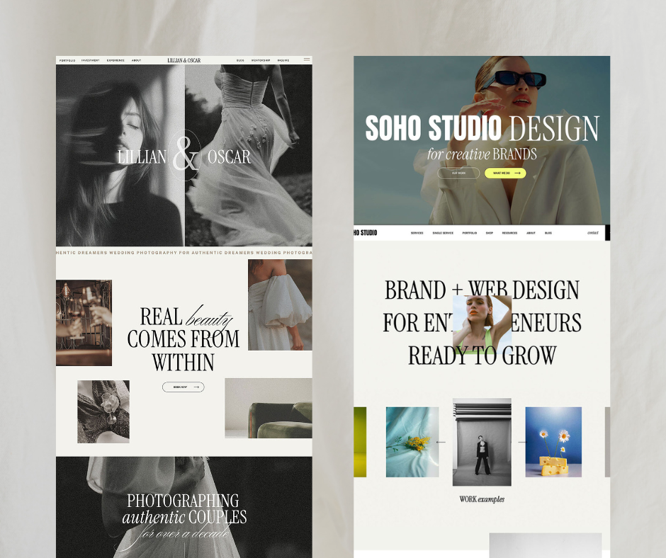
Read this once you’ve scrolled through the carousel for design references – I’m about to tell you the conversion secrets behind how I design templates that have found hundreds of women their dream clients!
The way a visitor is converted into a client or sale through your website is by following a journey to get to your point of sale – whether that’s a ‘buy now’ button or an inquiry form, the process is the same.
A website like Pink Summer is perfect, and here’s how it hooks ANY visitor in to reach that final destination (and what you can do to make your website do the same!)
✨ It starts with a WHAT and a WHO

Right at the top of the page, so any visitor can instantly see in a single line what you do and who you’re for.
As soon as they land on they’re page it makes them spill with excitement because they feel seen. Like you’re soul sisters, and they’re lucky to have found you (not the other way around!) — using emotional keywords like manifest, love and dreams here will leave them even more passionate.
✨ Then they’re sucked in by the design
The fonts, the colors, the inspiring photographs (thank god for Pexels!) that make their heart swoon. They can’t help but keep scrolling, because it’s so beautiful it’s like they’re flicking through pages of a magazine. They don’t even realize or care that they’re being sold to.

✨ The SCROLL LAYOUT takes them on a strategic journey, with blocks that hit all the points they want to know
What you can offer them, who you are, fun things that build a connection and make them feel like they need you in their life, gliding into each other effortlessly in the most satisfying way (Seriously, is there a nicer feeling than scrolling down a website where everything just melts into each other!?)
It’s like they’re riding a wave to exactly where you want them to be. And that’s what any website should feel like – Effortless.


Comments +