I am not going to lie, it is always a good idea to hire a professional photographer. With social media ramping up these days and the amount of photos you need to post, sometimes this isn’t feasible to use a professional photographer all the time. So if you find yourself tight on time or on a budget, here is how I did my personal branding photoshoot myself.

Step 1. Get inspiration on Pinterest.

Before I even make a move, I go straight to Pinterest to get ideas on the props I will need, decor, clothing choices and poses I can do. You can check out the board I made for this photo shoot here.
Step 2. Gather + buy

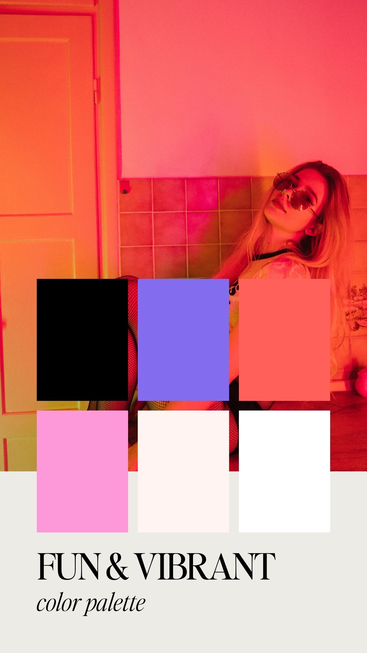
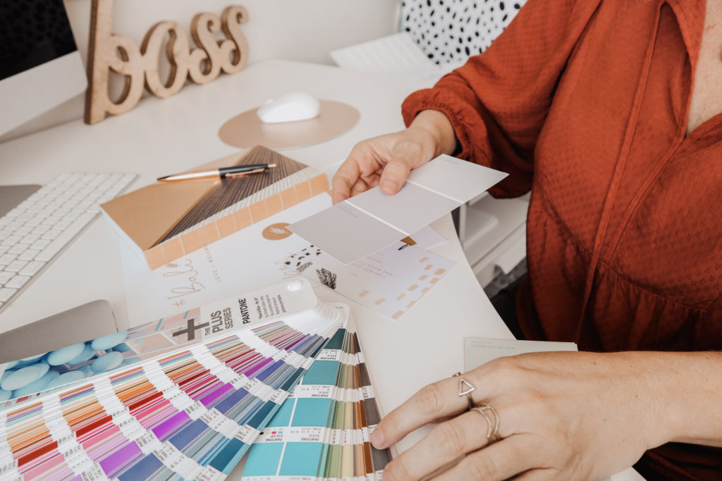
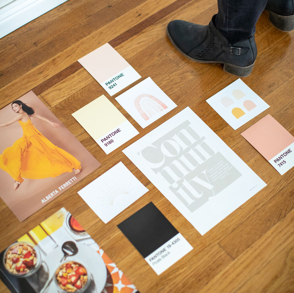
Now you can’t make money unless you spend money. I always will buy at least a few new tops to portray the looks I want in my photos. Also I love Target for props like my coffee mug, drink + notebook I used in my photos. Gather everything you need beforehand so that you are ready for the big day. Keep in mind that color coordinating is key and the colors you choose should match your brand colors. If you need help creating your brand colors you can download my free guide here.
Step 3. Set up

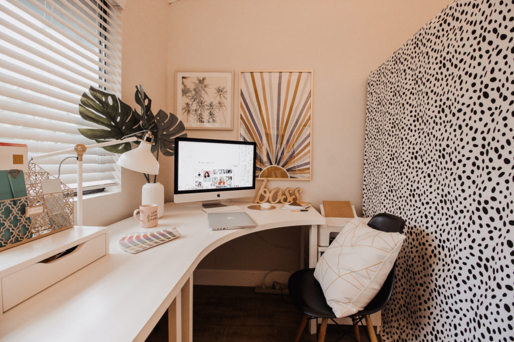
I like to set up a bit a few days beforehand, making sure I have the right camera angles, the tripods set up correctly and the right backgrounds. I do a few test shots to make sure that everything works right and I try on all my outfits to pick my favorites. I usually choose about 5 outfits but ultimately end up with about 3. Now if you have jackets, then those outfits turn into two outfits when you take the jacket off to save time. I recommend buying heavy fabric backgrounds to cover anything unsightly in your office. I also recommend taking the photos where you actually work like in your office or maybe a coffee shop if you don’t have an office. However this tutorial is really geared towards a home office situation.
Step 4. Take your pics

Be sure to do your makeup and hair beforehand. I honestly find that face makeup is good medium coverage and no eyeliner, just mascara works best for me. It has a natural look that is easy to approach and professional. However do what works best for your face. I also always do at least a little curl in the hair. It looks a bit more polished. Set up your tripods and make sure you have plenty of light. It is best to use natural lighting so if you can face a window morning light works great. If you don’t have adequate lighting in your office, you will need to buy lights. Try a ring light + also standing lights that have an umbrella on them to provide soft shadows.

Tips:

  • Don’t forget to take pictures of objects + props and not just images of you
  • I find it best to not always look directly at the camera, but look away and smile like you are talking to someone or thinking about something funny
  • Do make sure to use your props like your laptop and pretend you are working
  • Act natural like you are actually working in your office ( a very clean and organized version of your office that is)
  • Don’t forget to take headshots you can use on social media with solid or pattern backgrounds

That’s it! Good luck! Be sure to tag me in your photos if you use my tutorial 🙂

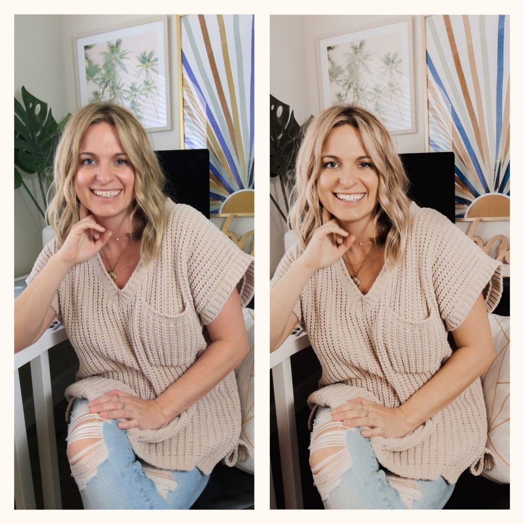
If you want your photos to have the same coloring & look like this – download my Lightroom presets FREE.

Comments +

Leave a Reply

Your email address will not be published. Required fields are marked *

read the recent posts

You’re going to want to bookmark this because it’s the MOST important advice you’ll read all day.

Here’s what’s coming up in 2023, and what you can do to stay on top of it.

01. Viva Magenta

You know the company Pantone? Not many people know, but they have a ‘color of the year’ and this year it’s viva magenta!

Why is it important? Because vivid magenta is the opposite of the neutral colors that have dominated in recent years, which means that boho trends are over and quirky, striking designs are in. I’m not saying you should rebrand with hot pink, but it’s great to be mindful of how relevant your current design palette is.

(This is why I love templates – you can rebrand in the space of an afternoon!)

02. Social Media will become a customer service tool

This isn’t just for big companies!

Stop focusing your Instagram content on selling, and start using it for connection. Instead of Call to Actions, start finding ways to start conversations instead. Ask questions with your content, spend time replying to comments and starting new DM threads over trying to make Instagram convert for you, because it won’t!

When your audience organically migrates to your website, if they feel they visited from their own free-will they have a higher chance to convert.

03. Automations

We’re busy people and don’t have all day to spend searching for the answers – We want them to come to us.

Pink Showit website template

How can you save your potential clients time and money? Make graphic posts that are straight-up so they don’t have to search for value, and structure your website so it’s straight to the point and easy for them to buy your product with a single click.

Want more tips? Bookmark this post and click the link SHOP WEBSITE TEMPLATES for NEW 2023 website templates (Including ‘Pink Summer’ from this post!) free templates and even more design advice on my blog! ✨

And YES these are all in Canva, have barely anybody using them yet and are the secrets most web designers don’t want you to know… You’re welcome 👊🏼

Traditionally, when we think “stylish” we think modern, minimal and clean. For the most part, the ‘stylish’ aesthetic draws inspiration from fashion (think brand logos like Chanel, Prada and Louis Vuitton!) and literature — serif fonts with a tall, angular construction.

This approach is definitely the best way to target a luxury consumer or brand a company rich in heritage!

But in 2023, “Stylish” doesn’t necessarily mean luxury — Especially if your client is younger, more rounded fonts might appeal to them more because their concept of style is more effortless and chic.

My tip? Pair serif headings with sans-serif body text for the perfect balance of culture and contemporary, for a well-rounded design that appeals to any client interested in art and fashion!

These are some of my latest Canva finds that you need to know if your brand revolves around style:


Serif: Joliet, Arcadian, Brown Sugar, Metanoia & Pierson
Sans Serif: Julius Sans One, Kollektif, Nourd & Nunito Light


Changing your fonts is a quick and easy way to refresh and rebrand your website and graphics! Our audiences are ever-changing, so we always need to keep on top of what’s fresh so we don’t get left behind.

Bookmark this post for reference when you’re next designing! ✨

Need more inspiration? Click the link in my resources page to peek my FREE templates – They work with all of these fonts and are perfect for any brand wanting to target women who love style.

No gatekeeping here — I’ve got you!! 🫶🏼

Warning: This wisdom could get you booked out (and is what all of my best selling templates are based on!) ✨

Read this once you’ve scrolled through the carousel for design references – I’m about to tell you the conversion secrets behind how I design templates that have found hundreds of women their dream clients!

The way a visitor is converted into a client or sale through your website is by following a journey to get to your point of sale – whether that’s a ‘buy now’ button or an inquiry form, the process is the same.

A website like Pink Summer is perfect, and here’s how it hooks ANY visitor in to reach that final destination (and what you can do to make your website do the same!)

✨ It starts with a WHAT and a WHO

Pink Showit website template

Right at the top of the page, so any visitor can instantly see in a single line what you do and who you’re for.

As soon as they land on they’re page it makes them spill with excitement because they feel seen. Like you’re soul sisters, and they’re lucky to have found you (not the other way around!) — using emotional keywords like manifest, love and dreams here will leave them even more passionate.

✨ Then they’re sucked in by the design

The fonts, the colors, the inspiring photographs (thank god for Pexels!) that make their heart swoon. They can’t help but keep scrolling, because it’s so beautiful it’s like they’re flicking through pages of a magazine. They don’t even realize or care that they’re being sold to.

✨ The SCROLL LAYOUT takes them on a strategic journey, with blocks that hit all the points they want to know

What you can offer them, who you are, fun things that build a connection and make them feel like they need you in their life, gliding into each other effortlessly in the most satisfying way (Seriously, is there a nicer feeling than scrolling down a website where everything just melts into each other!?)

It’s like they’re riding a wave to exactly where you want them to be. And that’s what any website should feel like – Effortless.

If you’re having to graft and grind to get your visitors to that destination you’re doing something wrong!

But with this wisdom the fix is easy as pie 🥧

DOWNLOAD NOW

GET A FREE SHOWIT WEBSITE TEMPLATE

freebie 

I've created a beautiful free website template that is designed to convert. This is perfect for anyone wanting to try Showit for free

view demo

Let's create a brand your clients will obsess over

Hi, I'm Melissa

With a spontaneous and imaginative flair, I specialize in…

Crafting beautiful brands for creative and passionate business owners like YOU so that your business communicates your message effectively with outstanding branding and visual graphics.

work with me

shop templates

Almost there!

Free guide

You can embed an email signup form here by pasting the code for one in a blank "embed" box.

Showit
WEBSITE TEMPLATES

Matching Canva
MARKETING TEMPLATES

Add a podcast, sales page or shop to your Showit website

Fully customizable website templates compatible with Showit

Social Media & Marketing templates to up your brand game

Matching Showit
ADD ON & SALES PAGES

Shop THE TEMPLATES