And YES these are all in Canva, have barely anybody using them yet and are the secrets most web designers don’t want you to know… You’re welcome ??
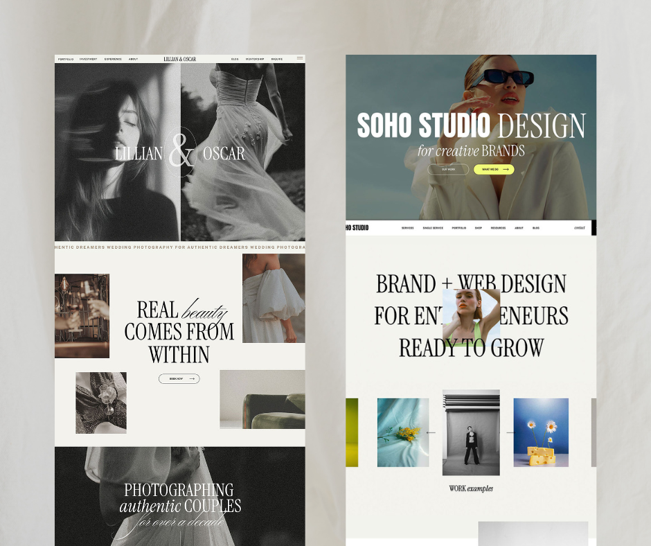
Traditionally, when we think “stylish” we think modern, minimal and clean. For the most part, the ‘stylish’ aesthetic draws inspiration from fashion (think brand logos like Chanel, Prada and Louis Vuitton!) and literature — serif fonts with a tall, angular construction.
This approach is definitely the best way to target a luxury consumer or brand a company rich in heritage!
But in 2023, “Stylish” doesn’t necessarily mean luxury — Especially if your client is younger, more rounded fonts might appeal to them more because their concept of style is more effortless and chic.
My tip? Pair serif headings with sans-serif body text for the perfect balance of culture and contemporary, for a well-rounded design that appeals to any client interested in art and fashion!
These are some of my latest Canva finds that you need to know if your brand revolves around style:

Serif: Joliet, Arcadian, Brown Sugar, Metanoia & Pierson
Sans Serif: Julius Sans One, Kollektif, Nourd & Nunito Light


Changing your fonts is a quick and easy way to refresh and rebrand your website and graphics! Our audiences are ever-changing, so we always need to keep on top of what’s fresh so we don’t get left behind.
Bookmark this post for reference when you’re next designing! ✨
Need more inspiration? Click the link in my resources page to peek my FREE templates – They work with all of these fonts and are perfect for any brand wanting to target women who love style.
No gatekeeping here — I’ve got you!! ??


Comments +