


Hey everyone! I’m Melissa Lunt, your go-to Showit website designer at Superhero Design. Today, I’m super excited to share some of the hottest color palettes for your Showit websites in 2024. Whether you’re working on personal branding, a business site, or just want to stay trendy, these palettes are perfect for you. Let’s dive into five fabulous color combinations that are sure to make your website pop!
1. Bold and Bright: Palette #1
First up, we have a palette that screams bold sophistication. This color combination is perfect if you’re looking to make a striking impression without compromising on elegance.

- Black (#000000)
- Dark Gray (#202020)
- Soft Yellow (#F4FC78)
- Sky Blue (A3C6C1)
- Warm Beige (#C6C2B4)
- White (#FFF)
This palette is fantastic for websites that want to exude a modern yet classic vibe. The black and dark gray provide a strong foundation, while the soft yellow adds a touch of warmth and energy. The warm beige and white balance everything out, making it perfect for highlighting your content. If you’re a female business owner looking for a sleek yet inviting color scheme, this one’s for you!
2. Minimal and Bright: Palette #2
If you love the minimalist aesthetic but still want a hint of color, this palette is a winner. It’s all about subtle elegance and understated beauty.

- Black (#000000)
- Deep Gray (#1d1d1d)
- Hot Purple (#B75AFF)
- Lavender (#E3BEFF)
- Soft Cream (#ECEBE5)
- White (#FFFFFF)
This palette is ideal for showcasing your content in a clean and organized way. The black and deep gray provide a solid base, while the lavender brings a touch of femininity and creativity. The soft cream and white ensure that your website remains light and airy. This combination is perfect for personal branding and businesses that want to convey sophistication and calm.
3. Romantic and Retro: Palette #3
Next, we have a palette that combines romance with earthy tones, creating a harmonious and grounded feel.

- Black (#000000)
- Charcoal Gray (#2B2B2B)
- Soft Pink (#EDBCCF)
- Light Olive (#DDE494)
- Cream (#F0F2E9)
- White (#FFFFFF)
This palette is great for websites that want to evoke a sense of romance and connection to nature. The charcoal gray and black provide depth and stability, while the soft pink and light olive add warmth and freshness. The cream color ties everything together, making your site feel inviting and cozy. This is a wonderful choice for female business owners who want a touch of whimsy in their branding.
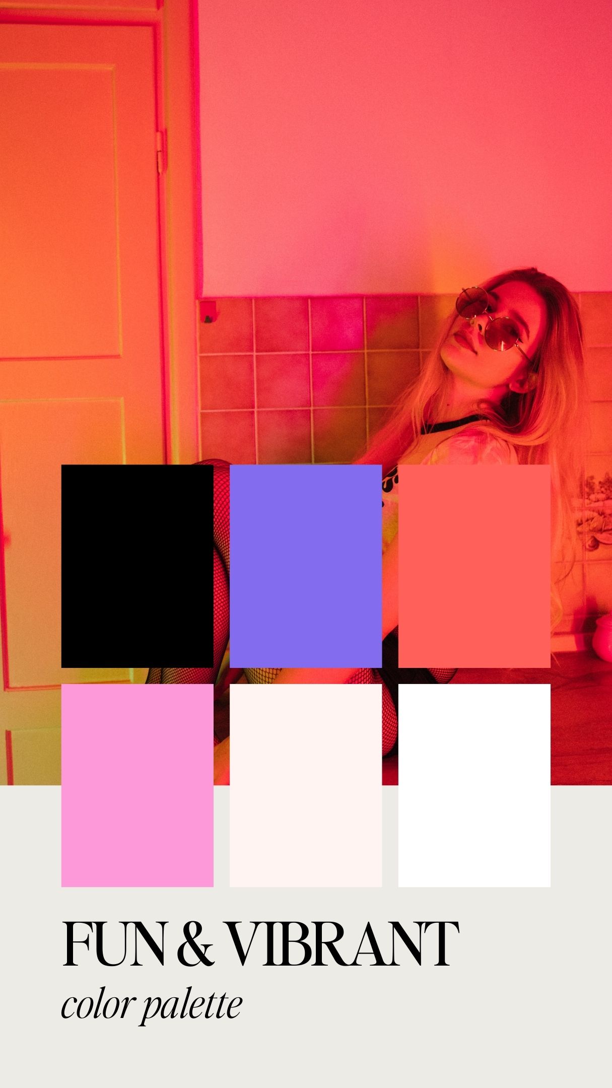
4. Fun and Vibrant: Palette #4
If you’re all about making a bold statement with your website, this vibrant palette is for you. It’s colorful, fun, and full of life!

- Black (#000000)
- Vibrant Purple (#836DEE)
- Bright Pink (#FE99D9)
- Pinky Orange (#FF605A)
- Light Peach (#FFF4F2)
- White (#FFFFFF)
This palette is perfect for businesses that want to stand out and show off their playful side. The black provides a strong contrast, allowing the vibrant purple, bright pink, and fiery orange to really pop. The light peach softens the palette, making it visually appealing and energetic without being overwhelming. This is ideal for Showit websites aiming to capture attention and convey a fun, dynamic brand.
5. Natural and Rustic: Palette #5
Finally, we have a palette that brings in natural, rustic tones perfect for a grounded and earthy website aesthetic.

- Dark Brown (#2A2721)
- Forest Green (#3C7860)
- Deep Green (#1B4E38)
- Rust Orange (#DB4A2B)
- Soft Gray (#E4E2DD)
- White (#FFFFFF)
This palette is perfect for websites that want to reflect a love for nature and rustic charm. The dark brown and greens provide a deep, earthy foundation, while the rust orange adds a warm, inviting touch. The soft gray balances the palette, ensuring it remains approachable and easy on the eyes. This is an excellent choice for female business owners who want their brand to feel authentic and connected to nature.
Why These Palettes Work for Showit Websites
Using these trendy color palettes on your Showit website can significantly enhance your site’s aesthetic appeal and user experience. Showit is known for its versatility and user-friendly interface, making it easy to incorporate these colors into your design. Here are a few reasons why these palettes are perfect for your Showit website:
- Versatility: These palettes are designed to be versatile, making them suitable for various types of websites, from personal blogs to business sites.
- Visual Hierarchy: Each palette provides a range of colors that can help establish a clear visual hierarchy, making your content easy to navigate and engaging.
- Brand Identity: The right color palette can reinforce your brand identity, making your website more memorable to your audience.
- Aesthetic Appeal: Trendy and well-chosen color palettes can make your website look modern and professional, attracting and retaining visitors.
- Emotional Impact: Colors have the power to evoke emotions. These palettes are crafted to create specific moods, whether it’s sophistication, fun, or a connection to nature.
How to Use These Palettes
When incorporating these color palettes into your Showit website, consider the following tips:
- Primary Colors: Use the darker shades (like black or dark gray) for text and backgrounds to create a strong foundation.
- Accent Colors: Use the brighter or softer shades (like soft yellow, lavender, or bright pink) for buttons, links, and highlights to draw attention to key elements.
- Balance: Ensure there’s a good balance between your primary and accent colors to keep the design cohesive and visually appealing.
- Consistency: Use your chosen palette consistently across all pages of your website to maintain a unified look and feel.
Choosing the right color palette is crucial for creating a visually appealing and effective Showit website.
These five trendy color palettes for 2024 offer a range of options to suit different styles and preferences. Whether you’re going for bold and bright, elegant and minimalist, romantic and earthy, fun and vibrant, or natural and rustic, there’s a palette here for you. Remember, your website is an extension of your brand, so choose colors that resonate with your message and audience.
I hope you find these color palettes inspiring and helpful for your next Showit website design! Happy designing!


")


Comments +