If you’re reading this, the chances are you’re one of the thousands of incredible entrepreneurs who discovered my website from Pinterest or Etsy where I sell hundreds of templates each month, or found my website through a Google search. Both of these have something huge in common, and that link is the reason you’re here and the secret to my success – and it’s exactly what I’m about to share with you (no gatekeeping!) so you can grow your audience and find thousands more sales, too…
It’s because my SEO is on-point across ALL of my platforms, which puts me on the first page. And for Etsy, that’s key!
Whether you’re just starting out with selling online or looking to boost your sales, Etsy is a great place to start and SEO is crucial. In this blog post, I’ll be sharing my biggest tips on how to write strong titles and descriptions, choose the best images, and streamline your marketing strategies to boost your Etsy listings.
Your journey to your first thousand sales starts right here!
Creating Strong, Searchable Titles that your Audience are Looking for
Your listing title is the first thing potential buyers see, and it’s your one-way ticket to appearing first page in search results. To stand out, you need to craft titles that are not only descriptive but also keyword-rich.
- Start by researching popular keywords in your niche and decide what’s a ‘primary’ and ‘secondary’ keyword. Primary keywords are usually the name of your product and the category it falls into, and secondary keywords are who the product is for or more distinct features. Everybody will search for the primary keywords, but only some will search for both the primary and secondary. For me, my primary keywords are “Showit website templates”, “web design” and “branding” and secondary are “coaches”, “photographers”, “influencers” etc.
- Place the most important keywords at the beginning of your title, as Etsy’s search algorithm gives more weight to the first few words. For example, a strong title might be: “Modern Showit Website Template for coaches, bloggers, photographers | Bold, stylish web design for entrepreneurs” This title not only tells the buyer exactly what they’re getting but also includes keywords that will help your listing appear in relevant searches!
Extra Tips:
Clarity is key! Avoid stuffing your title with too many keywords, which can make it look spammy. I always aim for a natural flow that provides enough information that lets my audience know what the product is, who it’s for, and a key feature.
Maximize the title length – Etsy allows up to 140 characters for your title, so you should use this space wisely to include as many relevant keywords and descriptors as possible.
Use Vertical Bars or Commas: Separate different keyword phrases with vertical bars (|) or commas to enhance readability and create a clean, professional appearance.
Include Unique Features that give you an edge above your competition! If your template has standout features like integrated SEO tools, a drag-and-drop builder, or exclusive design elements, mention them in the title. It’s great (and easier!) to appear on the first page of more niche Etsy searches, not just the main product ones.
Track Performance and Update with Trends: Your audience are constantly changing, so keep an eye on how your listings perform. If a title isn’t generating the desired traffic or sales, don’t hesitate to tweak it. Experiment with different keyword combinations and descriptions to see what works best – just because something sells like hotcakes one month, doesn’t mean it will forever!

Writing Descriptions that Boost SEO, Encourage Reviews and Generate Trust
Once you’ve hit the front page and captured all the attention with your SEO-rich listing title, your description needs to seal the deal and persuade your audience to hit ‘add to cart’. This is where you provide all the detailed information about your product and convince buyers that what you’re offering is exactly what they need!
- Start your description with a brief introduction that includes your main keywords. This not only helps with SEO but also quickly tells buyers what your product is. For example, for me this might look like: “Our modern Showit website template is perfect for graphic designers and creative entrepreneurs looking to elevate their online presence with a customizable, bold and SEO-friendly design.”
- Next, dive into the specifics. Highlight the specific features and benefits of your template. Mention its responsiveness, ease of customization, and any special elements like integrated SEO tools or unique design features that gives you a unique selling point. Answer common questions, such as installation instructions or compatibility details, to make your product feel trustworthy and share that you’re able to help every step of the way. The more information you can give them, the more likely they are to buy!
My listings ALWAYS include (and yours should, too!): A demo of my website, a list of features, Installation instructions, Details, FAQs and information about how my customers receive the product when they purchase.
- 3. You can end your description with a call to action or something like a discount that encourages them to buy, like a discount to seal the deal. Encourage buyers to add the item to their cart or favorite your shop (the more this happens, the more the Etsy algorithm will boost your shop to the first page) or offer a bundle discount. I always run a 20% off deal for Bundles on my Etsy shop!
Choosing Bold Images for your Etsy Listings that Command Attention and Get Clicked
Bold, High-quality images are crucial for stopping your audience’s scroll and showcasing your product in the best light. Here are my tips!
- Make your cover image straight-to-the-point: There are hundreds of listings on Etsy and your audience are scrolling fast, so the cover image needs to show them exactly what they’re looking for. Make sure it shows the main highlight/functionality of your product so they don’t have to search for it (because they won’t…)
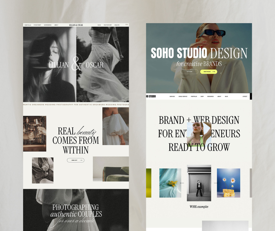
- Research and be inspired by your competitors! Usually, you’ll find that all the top listings for your type of product have nearly exactly the same style of cover image, and the reason is because that’s what works. For my product niche, it’s always a screenshot of the homepage and how the website looks on mobile, because these are what my audience care about the most.
- Use as much variety in your images as possible: Include screenshots of the product in use, close-ups of unique design elements, mock-ups and how your product looks on different platforms.
- Video is KEY and if you’re able to, a must! Etsy will push listings with videos higher, as the algorithm sees them as being the most trustworthy. If you’re stuck, a great idea is a walkthrough of your product.

Streamlining your Marketing Strategy to Boost your Sales on Etsy
The bottom line is: the more traffic your Etsy shop gets, the more sales you’ll make, and the higher your listings will rank. So it pays to put all of your eggs in one basket with your marketing, and make Etsy your only focus if it’s where you want to earn most of your sales. If you divide your strategy between multiple shops early on in your business, none of them will pull enough traffic to climb the listings ladder.
As somebody new to selling you might not have an email list or following you can blast yet, so I highly recommend Pinterest to start directing more traffic to your Etsy! I’m also one of the top Showit Website Designers in Pinterest search results, and you can find a complete guide to my Pinterest strategy here, but here are some quick tips on how you can start leveraging Pinterest to boost your sales with what you already have:
- Create Eye-Catching Pins that showcase your products by using high-quality images, bold text overlays, and your brand colors to make your pins stand out. You can use the same images as your Etsy listings!
- Optimize Pin Descriptions in the same way as your Etsy listings! Pinterest pins need strong, keyword-rich descriptions and you can use the same keywords from your Etsy listings to increase your pin’s visibility in searches.
- Link Directly to Your Etsy Listings by adding the direct link to your pin.
- Be Consistent and regularly pin new content to keep your profile active and engaging! The more you pin, the more opportunities you have to drive traffic to your Etsy shop.
Your journey towards your first 1,000 Sales on Etsy starts now!
As somebody who started building their empire through Etsy, trust me: strong Etsy listings serve as the foundation for growing your audience and reaching new heights in your business. By investing time and effort into optimizing your listings, you’re not just improving your chances of making a sale—you’re building a bold, professional presence that attracts dream clients. Embrace the power of strong listings and understanding SEO, and watch your Etsy shop and business thrive!
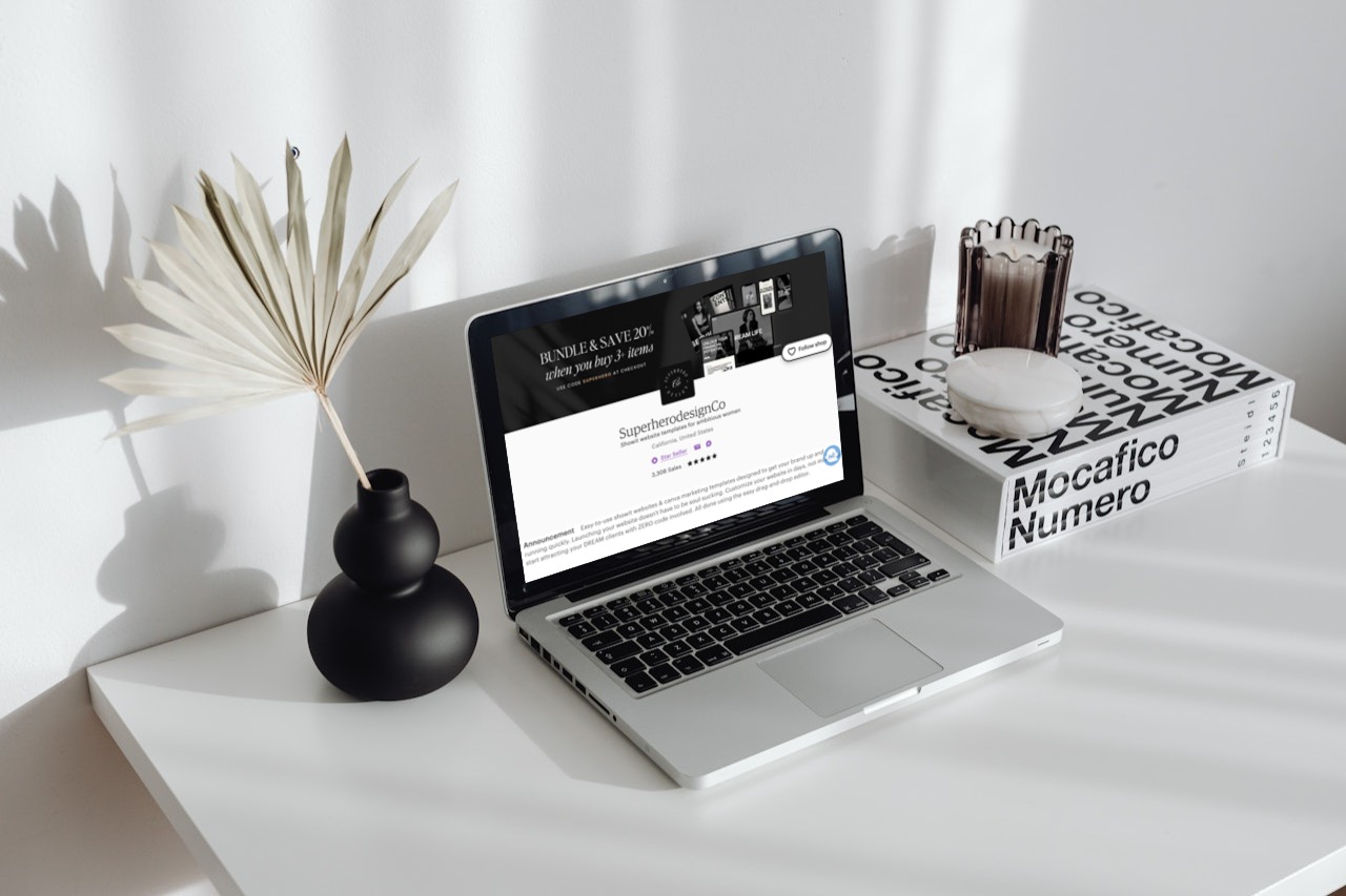
Feel free to visit my Etsy shop here, for direct inspiration for your listings!
To explore even more free resources for designers and business oweners, plus Canva templates and Showit website templates to instantly elevate your online presense click here to visit my shop! And for more design-lead knowledge and inspiration, Sign up for my email list (And I’ll send you a free template as a thank-you gift, too!) and follow me on Instagram.


Great post and so helpful, thank you!